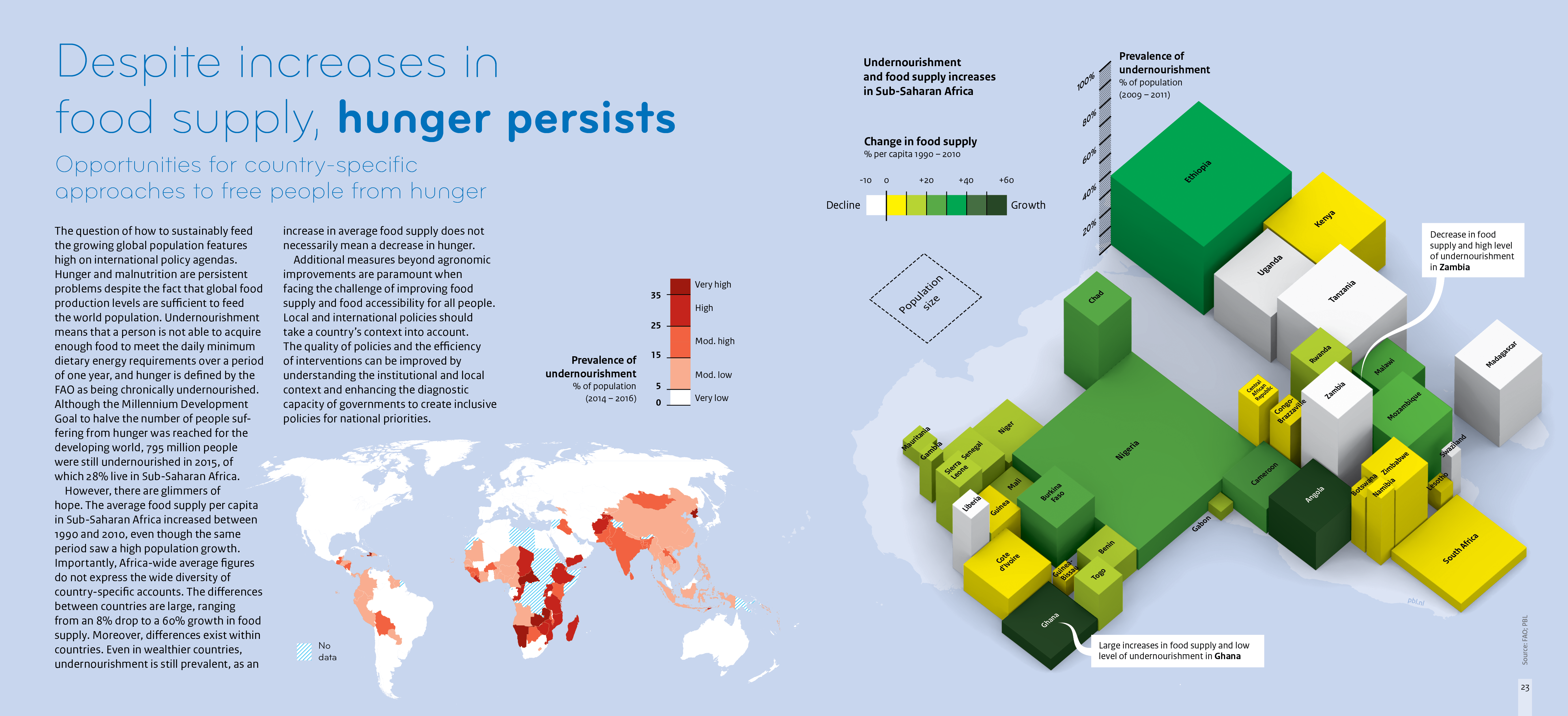
Map of undernourishment with high undernourishment in Sub-Saharan Africa and Southeast Asia. Infographic builds on this, showing countries in Sub-Saharan Africa in blocks, with 3 dimensions. 1 – base area is the population size, 2 – the height is prevalence of undernourishment, and 3 – the colour is the change in food supply. Some countries have high growth in food supply but still high undernourishment.
