People and the Earth

06-07-2017 | Publication

With the adoption of the UN 2030 Agenda for Sustainable Development, the world committed to an economically, socially, and environmentally sustainable world. The corresponding objectives, laid down in the Sustainable Development Goals (SDGs), emphasise the importance of managing the environment and natural resources to further both human development and the well-being of the global population.

The publication ‘People and the Earth: International cooperation for the Sustainable Development Goals in 23 infographics’ delivers a storyboard of human-nature interdependency, using visual representations to communicate challenges and options for making progress towards the UN’s 2030 Agenda for Sustainable Development. Our knowledge, models and tools have been the drivers of a close cooperation between PBL and the Dutch Ministry of Foreign Affairs for enhancing international policies. We hope that this book will inspire and enlighten the discussion on present and future international challenges.

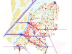
The sustainable development challenge for the Netherlands

The SDGs generate momentum for joint action, not only on the transition towards a more sustainable society in individual countries, but also on forging relationships between economies around the world. The Netherlands, with its open economy built on and shaped by international trade, is particularly facing the strategic urge to redefine its development within an international context.

Challenges for the nexus between food, water energy and land

Solutions to issues in relation to food, water, energy and land should not be considered in isolation, but by capturing synergies between the various demands for natural resources while managing tradeoffs. This means that a balancing of objectives is needed as well as the use of an integrated policy mix.

Exploring new partnerships and coalitions

The challenge is too large to be managed alone. If we want to ensure a good quality of life, including sufficient and affordable food, water, energy and natural resources for the future, then we need to mobilise all the creativity available. This calls for cooperation and multi-actor partnerships worldwide, on and between all levels in order to realise more inclusive and greener development pathways.

The 23 infographics

Below you will find all 23 infographics per book section. Please click on the images for more information and references.

Human development and dependencies on the Earth

Graphs show that population and GDP are increasing, alongside a demand for natural resources. Economic growth has improved human wellbeing, but has put pressure on the environment.
Nature provides us with benefits such as ecosystem services, which contributes towards our natural capital. Interconnected web showing multiple ecosystem services.
Global map showing that agreements on sustainable development have increased over the years, and have come together in 2015 in the Sustainable development goals.
Arrows show country and regional development pathways to a safe and just operating space. Safe, keeping within the bounds of the natural resource base, and just, in terms of supporting human wellbeing.
3 maps on population change in 2050. 1st map shows that rural population change is negative except for Sub-Saharan Africa, 2nd map shows total population change which is primarily positive though with a population decline in Russia, and the 3rd map shows urban population change with strong growth in Sub-Saharan Africa.
Bar chart showing the value of imports to and exports from the Netherlands from non-EU countries. Pie charts show that in the supply chain, most value added is generated in the Netherlands, while greenhouse gas emissions and land use impacts are elsewhere.

Challenges for the nexus between food, water, energy and land

Schematic showing development from economic growth, merging into inclusive growth and green growth and eventually into one inclusive green growth bubble.
Map of undernourishment with high undernourishment in Sub-Saharan Africa and Southeast Asia. Infographic builds on this, showing countries in Sub-Saharan Africa in blocks, with 3 dimensions. 1 – base area is the population size, 2 – the height is prevalence of undernourishment, and 3 – the colour is the change in food supply. Some countries have high growth in food supply but still high undernourishment.
Micronutrient and macronutrient maps showing high deficiency directly below the Sahara and central Africa. Micro and macronutrient deficiencies impact human health and nutrition.
Rapid growth in food demand in Sub-Saharan Africa from 2010 to 2050 compared to other countries. Bar graphs on the right show how food demand can be addressed in 2050 in business as usual and sustainability scenarios. Both primarily include closing yield gaps through intensification and to a lesser degree, agricultural expansion. The business as usual scenario also includes a small amount of imports.
Water consumption grows up until 2050 in a business as usual scenario. Map 1 (top) shows theoretical yield increases through irrigation efficiency in 2050, with most gains made in the Middle East. Map 2 (bottom) shows theoretical yield increases through improved rainwater management, where gains are more widespread globally.
Phosphorus emissions are highest in the southern hemisphere, excluding Australia. Additional treatment on household emissions to surface water is required to reach below 2010 levels in 2050. Illustration shows various challenges, including sewerage systems, and various solutions, such as on site sanitation.
Cities vulnerable to flooding in 2050 are mostly in Sub-Saharan Africa and Southeast Asia, and in coastal zones. Infographic right shows flood risk in cities, where flood risk will double by 2050 at a 1:100 protection level. Illustration shows various challenges including coastal flooding, and solutions, such as building with nature principles.
Bar chart shows distance to the central grid in 2010 and 2030 in Sub-Saharan Africa, which will decrease. Access to electricity and through which system depends on low or medium electricity consumption.
Leapfrogging: avoiding a lock in of traditional fossil fuel based development pathway. Graphs (right) show that future costs of renewable energy will be increasingly competitive. Bar chart (right) shows renewable energy has the economic potential to meet energy demand in 2010 and 2050. Figure (right) shows the increase in energy demand to 2030 and 2050, which requires global climate policy to leapfrog to low carbon energy development pathways.
Map shows biodiversity hotspots worldwide. Bar graph shows the main causes of biodiversity loss f.e. food production, energy and traffic and tourism. Proposed solutions: sparing, sharing and caring.
Agricultural land will increase in 2050, however, so will land that has reduced productivity. Most productivity decline is in agricultural rather than natural land. Regional productivity decline varies.

Exploring new partnerships and coalitions

Partnerships can involve civic, public and private actors and in order to work together, require 4 steps: diagnostics, partnership design, partnership implementation and impact evaluation.
Market shares data are compiled by PBL. Most Dutch market shares are for 2015, with the exception of fish (2014) and soya (2013). Most global shares are for 2013, with the exception of wood (2014) and fish (2015). The following information sources were used: 
Partnerships can connect urban and rural areas through product flow. Civic, public and private actors all play a role.
Left: growth without limits means not everyone is at the discussion table. Development may come at the cost of the environment, and benefits are unequally distributed. Right: all actors need to be at the table to negotiate, explore and plan, to design for inclusive and green growth.
The finance gap exists in multiple sectors. To bridge the gap, investment partnerships and funds are required to link multiple investors with projects on the ground through orchestrating and pooling finance, representing and prioritising interests, and sharing knowledge.
New agents of change are appearing in governance structures. Timeline: shows number of initiatives since 1922 to 2015, and their private, public or hybrid status. These initiatives are increasingly interconnected (web of biodiversity governance example).